Jessica loves...
Tuesday, July 2, 2019
My Life
For our final project, my class was given the opportunity to create a video. I chose to speak about how my life has changed in the past year. I hope this video will help someone who is feeling sad. <3
Wednesday, June 26, 2019
Music
The soundtrack to my life would be all over the place, which makes sense. You see that album cover. I obviously can't choose just one color. And I can't choose just one genre. So enjoy!
Thursday, June 20, 2019
My Album Cover
My album cover went through several designs and concepts before I chose and finalized this one. This album cover is total C.R.A.P. There is contrast in color with the alternating stripes, between the background and picture of me, and with the two fonts. Repetition can be found with the multiple stripes and colors. Things are aligned evenly with the picture being in the right third of the album cover. Proximity occurs because everything is spaced well.
 |
| Image 1: Jessica! happy times & good sunshine |
The title "happy times & good sunshine" comes from a quote by Brian Wilson of The Beach Boys. He once said "Summer means happy times and good sunshine." This quote inspired me because I absolutely love summer and the sunshine! I added a little lens flair to portray the summer vibe. It is faint, but adds some dimension to the bottom half of the album cover.
Wednesday, June 12, 2019
Album Cover Inspiration
I want my album cover to portray my love of summer and color.
I decided to look up Beach Boys albums and came across That's Why God Made the Radio. I really liked that there were multiple waves of different colors.
I decided to look up Beach Boys albums and came across That's Why God Made the Radio. I really liked that there were multiple waves of different colors.
 |
| Image 1: The Beach Boys "That's Why God Made the Radio" |
I also gathered inspiration from Mika's Life in Cartoon Color. This album is super bright, colorful, and happy, much like his music. I also really liked the fonts chosen, especially the contrast between the bold "MIKA" and cursive "life in cartoon motion". The long shadow coming from MIKA really caught my eye.
 |
| Image 2: Mika "Life in Cartoon Motion" |
Finally, I got inspiration from the One More Time by Daft Punk (apparently the other album cover I liked was fake...I double checked and this one is real!). I like how minimal but fun this album cover is.
Tuesday, June 11, 2019
Adjusting Composition
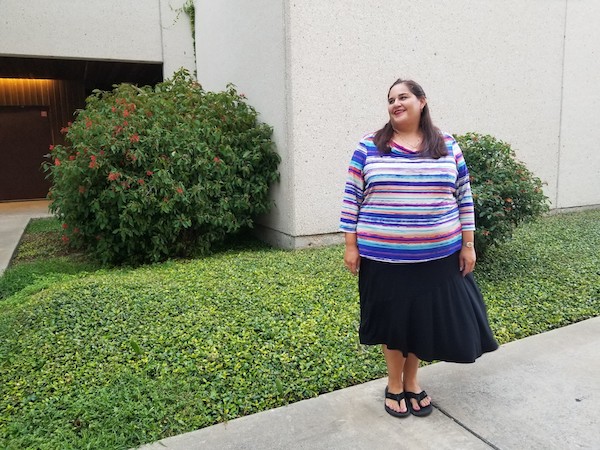
In COMM 5390 we are learning how to properly compose still images and then editing the frame. Here are some photos that my pal Bobby shot of me that I am editing. The original photos can be found here.
 |
| #7 image in 3:2 |
 |
| #7 image in 4:3 |
 |
| #7 image in 16:9 |
 |
| #6 image newly composed |
 |
| #1 transformed to #2 |
 |
| #3 transformed to #4 |
Monday, June 10, 2019
The Crocodile Hunter
The premier of The Crocodile Hunter may not be the most obvious historical event, but the show, which has been seen by more than 500 million people in 130 countries, has inspired millions of people and has kick-started numerous conservation efforts.
The Crocodile Hunter first aired in 1996 and starred Steve Irwin, an Australian zookeeper and conservationist. The show ran until 2004 following Steve Irwin's untimely death.
The Crocodile Hunter featured Steve Irwin interacting with various animals in the wild and in the Australia Zoo.
He was known for his enthusiasm and excitement for wildlife.
 |
| The Crocodile Hunter (image to be licensed from Google) |
Public Domain Video from archive.org
Steve's mission was to save wildlife which he accomplished through his television activism and the Wildlife Warriors, an organization that he and his wife, Terri, started in 2002.
 |
| The Crocodile Hunter (public domain) |
The Crocodile Hunter featured Steve Irwin interacting with various animals in the wild and in the Australia Zoo.
 |
| Steve Irwin presenting (public domain) |
He was known for his enthusiasm and excitement for wildlife.
 |
| Steve Irwin getting show ready (public domain) |
Fair use (cut multiple clips together on YouTube)
Class Photos
These photos of Aimee Anderson were taken to practice composing still images for COMM 5390.
 |
| Image 1: Symmetrically balanced composition |
 |
| Image 2: Asymmetrically balanced composition |
 |
| Image 3: Photo that obeys the rule of closure |
 |
| Image 4: Photo that does not obey the rule of closure |
 |
| Image 5: CU with appropriate headroom |
 |
| Image 6: LS with appropriate headroom |
 |
| Image 7: Balanced image that obeys the rules of thirds, balancing subject with weight of gaze |
Subscribe to:
Comments (Atom)


